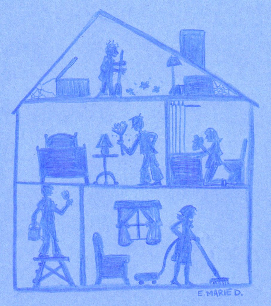
Clean I. I did this on blue tag board with coloured pencil. Not sure if I like this one or the one where colour was added.
 Detail on Clean I.
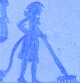
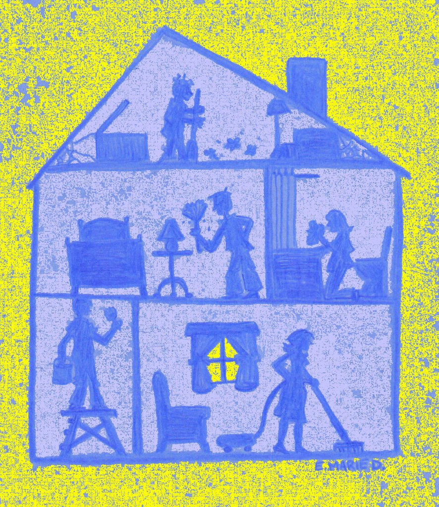
(Please click to enlarge.)
Clean II the Re-Do- Illustration Friday challenge.'Cleanliness is next to Godliness.' This statement was spoken, I'm sure, years before they ever heard of 'Obsessive Compulsive Disorder!' Check out this website on the origin of sayings to find out more!
Also, check out this awesome site! How to Clean Anything. Don't foget to buy a lint card before leaving!!
think i like the monotone 1 best. nice that u have and army to help u clean house lol
ReplyDeleteCleaning is never done. Nice work.
ReplyDelete8^)
a clean house means happy people heehe
ReplyDeletevery nice!
great concept! I definitely like the first one better, the yellow is a bit jarring. if the blue was more contrasty it might work even better...?
ReplyDeleteI like the yellow one best, it is a little jarring but I like the textuer and it also puts the house in some sort of perspective, specially the window.
ReplyDeleteGreat idea, Ellen! It's like the cross section of a doll house. I like them both but the yellow makes it pop more especially with the window!
ReplyDeleteI like them both, and really like the comnposition and way you drew it. :-)
ReplyDeleteOoooh, and nice ladder too. ;-)
ReplyDeletei like them both! nicely done :)
ReplyDeleteI like the yellow one too. The spot of light shining in the window adds some depth and a focal point. Cheers!
ReplyDeleteI actually like the bottom one best...it creates more of a statement for me. I see this obsessed family spending all their time cleaning and dusting, and all the while the sun is shining and they're missing out! I also love the grainy texture and the way a bit og the yellow comes through the window. Good one, Ellen!
ReplyDeleteThis is a sublime pic - it captures so much humanity, with such style and deftness! You know the version without the colour is the right one :). I want to see this on the cover of a CD, or an independent comic, or a children's picture book, or as a magazine editorial illustration. I love that it was done with organic (non-computer) tools as well.
ReplyDeleteOccasionally, I download favourite IF pics, because I know I'll want to see them again and I see one of my faves is now on your masthead (was that "Float"?) - an excellent choice!
love the silos...you have alot of details just with shapes...awesome.
ReplyDeleteNice series, and design concept!
ReplyDeleteI like this illo! The effect is very special!
ReplyDelete